
Using sysstat and gnuplot to analyse your Linux systems

Are you looking for a way to create nice charts from sysstat data? Sysstat is a powerful tool that collects and reports various system performance metrics, such as CPU, memory, disk, network, and more. But sometimes, you may want to visualize the data more appealingly and intuitively, such as using charts. In this post, I will show you how to create nice charts from sysstat data using a simple and free tool called Gnuplot. No Python is required!
Gnuplot is a command-line program that plots data and functions in many formats, such as PNG, JPEG, PDF, SVG, and more. It can also handle various data types, such as time series, histograms, pie charts, and scatter plots. Gnuplot is available for Linux, Windows, Mac OS X, and other platforms.
To create nice charts from sysstat data using Gnuplot, you will need to follow these steps:
Install sysstat and Gnuplot on your system. You can use your package manager or download them from their official websites.
Collect sysstat data using the sar command. You can specify the interval and duration of the data collection and the metrics you want to monitor. For example, to collect CPU usage data every 10 seconds for 5 minutes, you can use this command:
sar -u 10 30Save the sysstat data to a file using the -o option. For example, to save the CPU usage data to a file called cpu.dat, you can use this command:
sar -u 10 30 -o cpu.datThen you need to convert your .dat (binary) to txt
sar -u -f cpu.dat > cpu.txtPlot the sysstat data using Gnuplot. You will need to specify the input file, the output format and file name, the title and labels of the chart, the style and colour of the lines, and the range of the x-axis and y-axis.
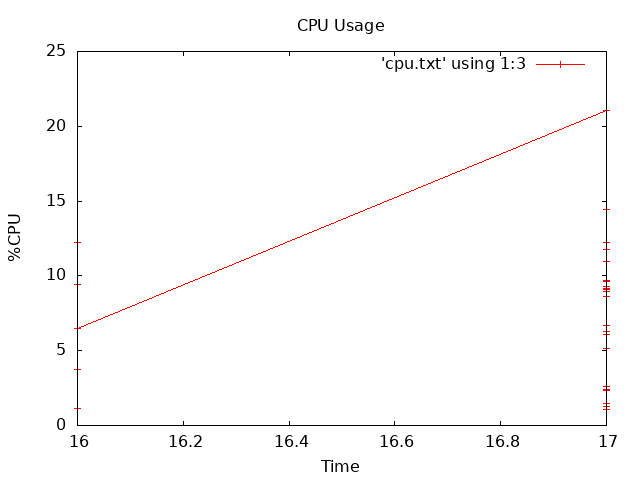
For example, to plot the CPU usage data in a PNG file called cpu.png, with a title of "CPU Usage", x-axis label of "Time", y-axis label of "%CPU", line style of lines points, and colour of red, you can use this command:
gnuplot -e "set terminal png; set output 'cpu.png'; set title 'CPU Usage'; set xlabel 'Time'; set ylabel '%CPU'; set style data linespoints; plot 'cpu.txt' using 1:3 with linespoints lc rgb 'red'"You can open the output file with any image viewer or browser. You can also tweak the Gnuplot command to customize your chart further.
Here is an example of how the chart may look like:
As you can see, creating charts from sysstat data is easy and fun with Gnuplot. You can use this method to visualize any sysstat metric you want. You can also combine multiple metrics in one chart or create multiple charts for different metrics. The possibilities are endless!
If you are impatient and need a quick way to analyse data for a given set of days, have a go at this fantastic online resource as well ( I use the self hosted version )
I hope you found this post helpful and informative. If you have any questions or feedback, please Reach out to me!